Insights
Aug 30, 2026
Heatmaps for Modern Sites: 5 Steps to Accurate, Actionable Data
Heatmaps for Modern Sites: 5 Steps to Accurate, Actionable Data
A tool agnostic framework for heatmaps on SPAs and dynamic sites. Follow five steps to collect accurate data, avoid false positives, and validate fixes.
A tool agnostic framework for heatmaps on SPAs and dynamic sites. Follow five steps to collect accurate data, avoid false positives, and validate fixes.
Heatmaps for Modern Sites: 5 Steps to Accurate, Actionable Data
A website heatmap is a visual overlay that turns clicks, scrolls, and cursor movement into colour maps showing exactly where visitors engage and where they drop off. Its real value is diagnostic: it surfaces friction points, confirms whether your calls-to-action get noticed, and helps you decide which A/B tests are worth running. Free options like Microsoft Clarity cover the basics; the right paid tool depends on your site’s complexity.
TL;DR:
Static heatmaps are unreliable for modern, dynamic sites because they cannot accurately reflect content loaded via JavaScript frameworks or responsive layouts.
Cross-referencing heatmap signals with analytics and session replays helps prevent false positives, especially with cold zones on primary CTAs or misleading click patterns.
Mobile behavior differs significantly from desktop patterns, making device-based segmentation essential for correct heatmap interpretation.
For complex or JavaScript-heavy sites, choose DOM-aware tools that read live page structures, and verify accuracy through session replay and click count comparisons.
Reliable insights require collecting enough data over at least a week to account for traffic variations and avoid acting on early or noisy results.
Table of Contents
What types of heatmaps for websites should you use?
How do you read a heatmap without jumping to the wrong conclusion?
Why do static heatmaps get the picture wrong on modern sites?
How do you choose the right heatmap tool for your site?
What are the first five steps to get reliable heatmap data?
How do heatmaps work alongside analytics and A/B testing?
How does Sun State Digital actually use heatmaps with clients?
Where to go for deeper reading on heatmap tools
Sources
What types of heatmaps for websites should you use?
Not every heatmap answers the same question, and picking the wrong type wastes a trial period. Qualtrics breaks heatmaps into three core categories: click maps, scroll maps, and movement or attention maps. Mouseflow extends this further, listing types like friction and interactive maps that flag rage clicks and dead zones.
Click maps show exactly what gets tapped or clicked, ideal for checking whether your primary CTA button is actually visible or whether people are clicking a non-interactive image instead.
Scroll maps reveal how far down the page visitors travel, perfect for long-form content or product pages where you need to know if anyone reaches the pricing table.
Movement/attention maps approximate where eyes linger based on cursor behaviour, useful for reading pattern insights on blog posts or hero sections.
Eye-tracking approximations offer a rougher but faster substitute for true eye-tracking hardware.
Friction/interactive maps catch rage clicks, form abandonment, and error signals that indicate something is broken, not just ignored.
Always segment by device. A scroll map built from desktop sessions tells you almost nothing about how a page performs on a small mobile screen, and mobile behaviour usually looks very different.
How do you read a heatmap without jumping to the wrong conclusion?
Hot zones mean high engagement, cold zones mean the opposite, but the pattern itself doesn’t tell you why. A red cluster on a hero image might mean people love it, or it might mean they’re clicking it expecting a link that doesn’t exist. That’s a false positive, one of the most common misreads in heatmap analysis.
Watch for these misleading patterns before you act on them:
A “false bottom”: a strong colour band that looks like a natural stopping point but is actually caused by a slow-loading section beneath it.
Clicks concentrated on non-clickable elements, usually a sign your design language is confusing people about what’s interactive.
Cold zones on your primary CTA, which often means placement, not the offer itself, is the problem.
Turn each signal into a testable hypothesis. Cold CTA? Test moving it higher. Clicks on a static image? Test making it a real button. Then check that hypothesis against your actual conversion data before you commit resources to a rebuild.
Pro Tip: Never trust a heatmap in isolation. Cross-reference it against your analytics conversion rate for that page. If a “cold” zone still correlates with strong conversions, you might be looking at noise, not a real problem.
Why do static heatmaps get the picture wrong on modern sites?
Static, screenshot-based heatmaps capture a single image of a page and map clicks onto it. That works fine for a simple brochure site. It breaks down fast on single-page applications, tabbed content, lazy-loaded sections, and responsive layouts that render differently across screen sizes. Industry comparisons consistently flag this as a real accuracy gap for JavaScript-heavy sites, where the screenshot simply doesn’t match what most visitors saw.
Dynamic, DOM-aware heatmaps solve this by reading the live page structure rather than a snapshot, which matters if your site uses React, Vue, or heavy client-side rendering. Before trusting any heatmap output on a modern build, run a few quick checks:
Spot-check a handful of sessions with session replay to confirm the heatmap matches what actually happened on screen.
Compare click counts against your analytics event totals for the same page and date range.
Re-test after any major layout or framework change, since old heatmap data can silently go stale.
How do you choose the right heatmap tool for your site?
Site complexity should drive this decision more than price. A static brochure site and a React-based e-commerce store have completely different requirements, and the wrong choice means paying for features you’ll never use, or worse, getting data you can’t trust.
Work through these five criteria:
Site technology. SPAs and JavaScript-heavy builds need dynamic, DOM-aware rendering; simple HTML sites can get away with static screenshot tools.
Heatmap types needed. Confirm the tool covers click, scroll, and attention maps at minimum, and friction maps if form abandonment is a concern.
Companion features. Session replay, form analytics, and A/B testing integration turn a heatmap from a curiosity into a genuine optimisation engine. Zoho PageSense bundles heatmaps with A/B testing for exactly this reason.
Data retention and privacy. Check how long session data is stored and whether the vendor masks sensitive form fields by default.
Support and pricing model. Per-session pricing scales differently to flat monthly tiers, and that matters a lot once traffic grows.
Microsoft Clarity is genuinely enough for many small businesses. It’s free, has no session caps, and includes AI-generated summaries that flag behavioural trends without manual digging. Where it falls short is advanced segmentation and native A/B testing, which is where paid platforms like Mouseflow or Zoho PageSense earn their keep.
Before signing anything, ask a vendor these questions in a demo:
Does this render dynamically on our actual site, or just take a screenshot?
Can I segment heatmaps by traffic source, device, or new versus returning visitors?
What’s the minimum session count before your reporting becomes statistically meaningful?
How is session replay data stored, and can I redact sensitive fields?
What are the first five steps to get reliable heatmap data?
Getting from installation to usable insight usually takes longer than people expect, mostly because they act too early on too little data.
Install and verify the tracking snippet, then confirm it’s firing correctly using the tool’s own debug view.
Choose specific pages and segments to track first, rather than turning it on site-wide and drowning in noise.
Collect a baseline of sessions before drawing any conclusions, generally a few hundred visits per page at minimum.
Cross-check against session replay to confirm the heatmap pattern reflects real behaviour, not a tracking glitch.
Convert your strongest observation into an A/B test idea rather than shipping a design change on instinct alone.
If you’re installing via a tag manager, double-check the snippet fires on route changes for SPAs. It’s a common gap that leaves entire sections of a single-page app untracked.
Pro Tip: Give any new heatmap install at least a full week before drawing conclusions. Weekday and weekend traffic often behaves completely differently, and a Tuesday-only sample will mislead you.
How do heatmaps work alongside analytics and A/B testing?
A heatmap on its own generates hypotheses, not proof. The workflow that actually moves the needle looks like this: heatmaps flag where attention drops, analytics tells you which pages matter most by traffic and revenue, session replay shows you why a specific visitor bounced, and A/B testing confirms whether your fix actually works.
Use heatmaps to spot a cold CTA, then check analytics to confirm that page gets enough traffic to be worth fixing.
Use session replay to watch a handful of sessions where the heatmap showed unusual friction.
Run an A/B test on the specific change your heatmap and replay data suggested, never on a hunch alone.
Most modern platforms, including Zoho PageSense and Mouseflow, now integrate heatmaps directly with A/B testing tools, which keeps this workflow inside one dashboard rather than three separate logins. Keep an eye on data governance too, particularly around how long session recordings are retained and whether personal data in form fields gets masked automatically.
How does Sun State Digital actually use heatmaps with clients?
We treat heatmaps as a diagnostic step, not a decoration. Strategy comes before spend in every project we run, which means we look at where visitors actually get stuck before recommending a single design change or ad dollar. That approach shaped the work behind our Ray White Aspley results, where lead costs dropped significantly once we identified and fixed the friction points the data pointed to.
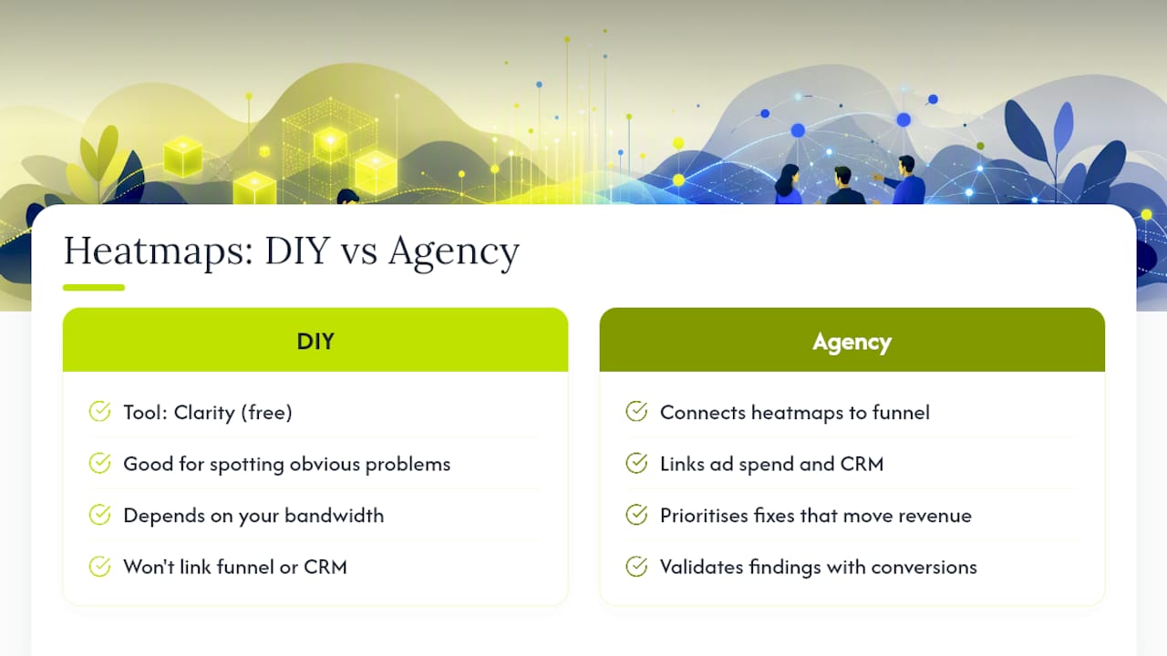
If you’re weighing up doing this yourself versus calling in help, the honest answer depends on your bandwidth, not your budget. A free tool like Clarity is genuinely fine for spotting obvious problems, while an agency earns its fee by connecting heatmap signals to your broader funnel, your ad spend, and your CRM data, then prioritising which fix actually moves revenue.
If you do bring in an agency, ask them directly how they validate heatmap findings against real conversion data, not just visual patterns.
— Joshua
Where to go for deeper reading on heatmap tools
For hands-on detail beyond what fits here, these are worth bookmarking:
Microsoft Clarity for free heatmaps, session recordings, and AI-generated behavioural summaries.
Qualtrics’s guide to heatmap types for a clear breakdown of click, scroll, and attention maps.
Zoho PageSense’s heatmap documentation for consolidated heatmaps and A/B testing integration.
Mouseflow’s heatmap tool overview for friction and interactive map types.
Inspectlet’s comparison guide for static versus dynamic rendering accuracy.
Read each vendor’s own privacy and installation documentation before deploying tracking scripts, since data retention rules and consent requirements vary by provider. For a broader testing framework once your heatmap data is flowing, this 90-day analytics playbook is a solid companion resource.
If you’d rather have someone map the friction points for you and turn them into a prioritised action plan, Sun State Digital’s growth audit is a practical starting point, and our website design team can implement whatever the data points to.
Sources
Recommended
Stay Inspired
Get fresh design insights, articles, and resources delivered straight to your inbox.
Latest Blogs



Stay Inspired
Get fresh design insights, articles, and resources delivered straight to your inbox.
Insights
Aug 30, 2026
Heatmaps for Modern Sites: 5 Steps to Accurate, Actionable Data
Heatmaps for Modern Sites: 5 Steps to Accurate, Actionable Data
A tool agnostic framework for heatmaps on SPAs and dynamic sites. Follow five steps to collect accurate data, avoid false positives, and validate fixes.
A tool agnostic framework for heatmaps on SPAs and dynamic sites. Follow five steps to collect accurate data, avoid false positives, and validate fixes.
Heatmaps for Modern Sites: 5 Steps to Accurate, Actionable Data
A website heatmap is a visual overlay that turns clicks, scrolls, and cursor movement into colour maps showing exactly where visitors engage and where they drop off. Its real value is diagnostic: it surfaces friction points, confirms whether your calls-to-action get noticed, and helps you decide which A/B tests are worth running. Free options like Microsoft Clarity cover the basics; the right paid tool depends on your site’s complexity.
TL;DR:
Static heatmaps are unreliable for modern, dynamic sites because they cannot accurately reflect content loaded via JavaScript frameworks or responsive layouts.
Cross-referencing heatmap signals with analytics and session replays helps prevent false positives, especially with cold zones on primary CTAs or misleading click patterns.
Mobile behavior differs significantly from desktop patterns, making device-based segmentation essential for correct heatmap interpretation.
For complex or JavaScript-heavy sites, choose DOM-aware tools that read live page structures, and verify accuracy through session replay and click count comparisons.
Reliable insights require collecting enough data over at least a week to account for traffic variations and avoid acting on early or noisy results.
Table of Contents
What types of heatmaps for websites should you use?
How do you read a heatmap without jumping to the wrong conclusion?
Why do static heatmaps get the picture wrong on modern sites?
How do you choose the right heatmap tool for your site?
What are the first five steps to get reliable heatmap data?
How do heatmaps work alongside analytics and A/B testing?
How does Sun State Digital actually use heatmaps with clients?
Where to go for deeper reading on heatmap tools
Sources
What types of heatmaps for websites should you use?
Not every heatmap answers the same question, and picking the wrong type wastes a trial period. Qualtrics breaks heatmaps into three core categories: click maps, scroll maps, and movement or attention maps. Mouseflow extends this further, listing types like friction and interactive maps that flag rage clicks and dead zones.
Click maps show exactly what gets tapped or clicked, ideal for checking whether your primary CTA button is actually visible or whether people are clicking a non-interactive image instead.
Scroll maps reveal how far down the page visitors travel, perfect for long-form content or product pages where you need to know if anyone reaches the pricing table.
Movement/attention maps approximate where eyes linger based on cursor behaviour, useful for reading pattern insights on blog posts or hero sections.
Eye-tracking approximations offer a rougher but faster substitute for true eye-tracking hardware.
Friction/interactive maps catch rage clicks, form abandonment, and error signals that indicate something is broken, not just ignored.
Always segment by device. A scroll map built from desktop sessions tells you almost nothing about how a page performs on a small mobile screen, and mobile behaviour usually looks very different.
How do you read a heatmap without jumping to the wrong conclusion?
Hot zones mean high engagement, cold zones mean the opposite, but the pattern itself doesn’t tell you why. A red cluster on a hero image might mean people love it, or it might mean they’re clicking it expecting a link that doesn’t exist. That’s a false positive, one of the most common misreads in heatmap analysis.
Watch for these misleading patterns before you act on them:
A “false bottom”: a strong colour band that looks like a natural stopping point but is actually caused by a slow-loading section beneath it.
Clicks concentrated on non-clickable elements, usually a sign your design language is confusing people about what’s interactive.
Cold zones on your primary CTA, which often means placement, not the offer itself, is the problem.
Turn each signal into a testable hypothesis. Cold CTA? Test moving it higher. Clicks on a static image? Test making it a real button. Then check that hypothesis against your actual conversion data before you commit resources to a rebuild.
Pro Tip: Never trust a heatmap in isolation. Cross-reference it against your analytics conversion rate for that page. If a “cold” zone still correlates with strong conversions, you might be looking at noise, not a real problem.
Why do static heatmaps get the picture wrong on modern sites?
Static, screenshot-based heatmaps capture a single image of a page and map clicks onto it. That works fine for a simple brochure site. It breaks down fast on single-page applications, tabbed content, lazy-loaded sections, and responsive layouts that render differently across screen sizes. Industry comparisons consistently flag this as a real accuracy gap for JavaScript-heavy sites, where the screenshot simply doesn’t match what most visitors saw.
Dynamic, DOM-aware heatmaps solve this by reading the live page structure rather than a snapshot, which matters if your site uses React, Vue, or heavy client-side rendering. Before trusting any heatmap output on a modern build, run a few quick checks:
Spot-check a handful of sessions with session replay to confirm the heatmap matches what actually happened on screen.
Compare click counts against your analytics event totals for the same page and date range.
Re-test after any major layout or framework change, since old heatmap data can silently go stale.
How do you choose the right heatmap tool for your site?
Site complexity should drive this decision more than price. A static brochure site and a React-based e-commerce store have completely different requirements, and the wrong choice means paying for features you’ll never use, or worse, getting data you can’t trust.
Work through these five criteria:
Site technology. SPAs and JavaScript-heavy builds need dynamic, DOM-aware rendering; simple HTML sites can get away with static screenshot tools.
Heatmap types needed. Confirm the tool covers click, scroll, and attention maps at minimum, and friction maps if form abandonment is a concern.
Companion features. Session replay, form analytics, and A/B testing integration turn a heatmap from a curiosity into a genuine optimisation engine. Zoho PageSense bundles heatmaps with A/B testing for exactly this reason.
Data retention and privacy. Check how long session data is stored and whether the vendor masks sensitive form fields by default.
Support and pricing model. Per-session pricing scales differently to flat monthly tiers, and that matters a lot once traffic grows.
Microsoft Clarity is genuinely enough for many small businesses. It’s free, has no session caps, and includes AI-generated summaries that flag behavioural trends without manual digging. Where it falls short is advanced segmentation and native A/B testing, which is where paid platforms like Mouseflow or Zoho PageSense earn their keep.
Before signing anything, ask a vendor these questions in a demo:
Does this render dynamically on our actual site, or just take a screenshot?
Can I segment heatmaps by traffic source, device, or new versus returning visitors?
What’s the minimum session count before your reporting becomes statistically meaningful?
How is session replay data stored, and can I redact sensitive fields?
What are the first five steps to get reliable heatmap data?
Getting from installation to usable insight usually takes longer than people expect, mostly because they act too early on too little data.
Install and verify the tracking snippet, then confirm it’s firing correctly using the tool’s own debug view.
Choose specific pages and segments to track first, rather than turning it on site-wide and drowning in noise.
Collect a baseline of sessions before drawing any conclusions, generally a few hundred visits per page at minimum.
Cross-check against session replay to confirm the heatmap pattern reflects real behaviour, not a tracking glitch.
Convert your strongest observation into an A/B test idea rather than shipping a design change on instinct alone.
If you’re installing via a tag manager, double-check the snippet fires on route changes for SPAs. It’s a common gap that leaves entire sections of a single-page app untracked.
Pro Tip: Give any new heatmap install at least a full week before drawing conclusions. Weekday and weekend traffic often behaves completely differently, and a Tuesday-only sample will mislead you.
How do heatmaps work alongside analytics and A/B testing?
A heatmap on its own generates hypotheses, not proof. The workflow that actually moves the needle looks like this: heatmaps flag where attention drops, analytics tells you which pages matter most by traffic and revenue, session replay shows you why a specific visitor bounced, and A/B testing confirms whether your fix actually works.
Use heatmaps to spot a cold CTA, then check analytics to confirm that page gets enough traffic to be worth fixing.
Use session replay to watch a handful of sessions where the heatmap showed unusual friction.
Run an A/B test on the specific change your heatmap and replay data suggested, never on a hunch alone.
Most modern platforms, including Zoho PageSense and Mouseflow, now integrate heatmaps directly with A/B testing tools, which keeps this workflow inside one dashboard rather than three separate logins. Keep an eye on data governance too, particularly around how long session recordings are retained and whether personal data in form fields gets masked automatically.
How does Sun State Digital actually use heatmaps with clients?
We treat heatmaps as a diagnostic step, not a decoration. Strategy comes before spend in every project we run, which means we look at where visitors actually get stuck before recommending a single design change or ad dollar. That approach shaped the work behind our Ray White Aspley results, where lead costs dropped significantly once we identified and fixed the friction points the data pointed to.
If you’re weighing up doing this yourself versus calling in help, the honest answer depends on your bandwidth, not your budget. A free tool like Clarity is genuinely fine for spotting obvious problems, while an agency earns its fee by connecting heatmap signals to your broader funnel, your ad spend, and your CRM data, then prioritising which fix actually moves revenue.
If you do bring in an agency, ask them directly how they validate heatmap findings against real conversion data, not just visual patterns.
— Joshua
Where to go for deeper reading on heatmap tools
For hands-on detail beyond what fits here, these are worth bookmarking:
Microsoft Clarity for free heatmaps, session recordings, and AI-generated behavioural summaries.
Qualtrics’s guide to heatmap types for a clear breakdown of click, scroll, and attention maps.
Zoho PageSense’s heatmap documentation for consolidated heatmaps and A/B testing integration.
Mouseflow’s heatmap tool overview for friction and interactive map types.
Inspectlet’s comparison guide for static versus dynamic rendering accuracy.
Read each vendor’s own privacy and installation documentation before deploying tracking scripts, since data retention rules and consent requirements vary by provider. For a broader testing framework once your heatmap data is flowing, this 90-day analytics playbook is a solid companion resource.
If you’d rather have someone map the friction points for you and turn them into a prioritised action plan, Sun State Digital’s growth audit is a practical starting point, and our website design team can implement whatever the data points to.
Sources
Recommended
Stay Inspired
Get fresh design insights, articles, and resources delivered straight to your inbox.
Latest Blogs
Stay Inspired
Get fresh design insights, articles, and resources delivered straight to your inbox.
Insights
Aug 30, 2026
Heatmaps for Modern Sites: 5 Steps to Accurate, Actionable Data
Heatmaps for Modern Sites: 5 Steps to Accurate, Actionable Data
A tool agnostic framework for heatmaps on SPAs and dynamic sites. Follow five steps to collect accurate data, avoid false positives, and validate fixes.
A tool agnostic framework for heatmaps on SPAs and dynamic sites. Follow five steps to collect accurate data, avoid false positives, and validate fixes.
Heatmaps for Modern Sites: 5 Steps to Accurate, Actionable Data
A website heatmap is a visual overlay that turns clicks, scrolls, and cursor movement into colour maps showing exactly where visitors engage and where they drop off. Its real value is diagnostic: it surfaces friction points, confirms whether your calls-to-action get noticed, and helps you decide which A/B tests are worth running. Free options like Microsoft Clarity cover the basics; the right paid tool depends on your site’s complexity.
TL;DR:
Static heatmaps are unreliable for modern, dynamic sites because they cannot accurately reflect content loaded via JavaScript frameworks or responsive layouts.
Cross-referencing heatmap signals with analytics and session replays helps prevent false positives, especially with cold zones on primary CTAs or misleading click patterns.
Mobile behavior differs significantly from desktop patterns, making device-based segmentation essential for correct heatmap interpretation.
For complex or JavaScript-heavy sites, choose DOM-aware tools that read live page structures, and verify accuracy through session replay and click count comparisons.
Reliable insights require collecting enough data over at least a week to account for traffic variations and avoid acting on early or noisy results.
Table of Contents
What types of heatmaps for websites should you use?
How do you read a heatmap without jumping to the wrong conclusion?
Why do static heatmaps get the picture wrong on modern sites?
How do you choose the right heatmap tool for your site?
What are the first five steps to get reliable heatmap data?
How do heatmaps work alongside analytics and A/B testing?
How does Sun State Digital actually use heatmaps with clients?
Where to go for deeper reading on heatmap tools
Sources
What types of heatmaps for websites should you use?
Not every heatmap answers the same question, and picking the wrong type wastes a trial period. Qualtrics breaks heatmaps into three core categories: click maps, scroll maps, and movement or attention maps. Mouseflow extends this further, listing types like friction and interactive maps that flag rage clicks and dead zones.
Click maps show exactly what gets tapped or clicked, ideal for checking whether your primary CTA button is actually visible or whether people are clicking a non-interactive image instead.
Scroll maps reveal how far down the page visitors travel, perfect for long-form content or product pages where you need to know if anyone reaches the pricing table.
Movement/attention maps approximate where eyes linger based on cursor behaviour, useful for reading pattern insights on blog posts or hero sections.
Eye-tracking approximations offer a rougher but faster substitute for true eye-tracking hardware.
Friction/interactive maps catch rage clicks, form abandonment, and error signals that indicate something is broken, not just ignored.
Always segment by device. A scroll map built from desktop sessions tells you almost nothing about how a page performs on a small mobile screen, and mobile behaviour usually looks very different.
How do you read a heatmap without jumping to the wrong conclusion?
Hot zones mean high engagement, cold zones mean the opposite, but the pattern itself doesn’t tell you why. A red cluster on a hero image might mean people love it, or it might mean they’re clicking it expecting a link that doesn’t exist. That’s a false positive, one of the most common misreads in heatmap analysis.
Watch for these misleading patterns before you act on them:
A “false bottom”: a strong colour band that looks like a natural stopping point but is actually caused by a slow-loading section beneath it.
Clicks concentrated on non-clickable elements, usually a sign your design language is confusing people about what’s interactive.
Cold zones on your primary CTA, which often means placement, not the offer itself, is the problem.
Turn each signal into a testable hypothesis. Cold CTA? Test moving it higher. Clicks on a static image? Test making it a real button. Then check that hypothesis against your actual conversion data before you commit resources to a rebuild.
Pro Tip: Never trust a heatmap in isolation. Cross-reference it against your analytics conversion rate for that page. If a “cold” zone still correlates with strong conversions, you might be looking at noise, not a real problem.
Why do static heatmaps get the picture wrong on modern sites?
Static, screenshot-based heatmaps capture a single image of a page and map clicks onto it. That works fine for a simple brochure site. It breaks down fast on single-page applications, tabbed content, lazy-loaded sections, and responsive layouts that render differently across screen sizes. Industry comparisons consistently flag this as a real accuracy gap for JavaScript-heavy sites, where the screenshot simply doesn’t match what most visitors saw.
Dynamic, DOM-aware heatmaps solve this by reading the live page structure rather than a snapshot, which matters if your site uses React, Vue, or heavy client-side rendering. Before trusting any heatmap output on a modern build, run a few quick checks:
Spot-check a handful of sessions with session replay to confirm the heatmap matches what actually happened on screen.
Compare click counts against your analytics event totals for the same page and date range.
Re-test after any major layout or framework change, since old heatmap data can silently go stale.
How do you choose the right heatmap tool for your site?
Site complexity should drive this decision more than price. A static brochure site and a React-based e-commerce store have completely different requirements, and the wrong choice means paying for features you’ll never use, or worse, getting data you can’t trust.
Work through these five criteria:
Site technology. SPAs and JavaScript-heavy builds need dynamic, DOM-aware rendering; simple HTML sites can get away with static screenshot tools.
Heatmap types needed. Confirm the tool covers click, scroll, and attention maps at minimum, and friction maps if form abandonment is a concern.
Companion features. Session replay, form analytics, and A/B testing integration turn a heatmap from a curiosity into a genuine optimisation engine. Zoho PageSense bundles heatmaps with A/B testing for exactly this reason.
Data retention and privacy. Check how long session data is stored and whether the vendor masks sensitive form fields by default.
Support and pricing model. Per-session pricing scales differently to flat monthly tiers, and that matters a lot once traffic grows.
Microsoft Clarity is genuinely enough for many small businesses. It’s free, has no session caps, and includes AI-generated summaries that flag behavioural trends without manual digging. Where it falls short is advanced segmentation and native A/B testing, which is where paid platforms like Mouseflow or Zoho PageSense earn their keep.
Before signing anything, ask a vendor these questions in a demo:
Does this render dynamically on our actual site, or just take a screenshot?
Can I segment heatmaps by traffic source, device, or new versus returning visitors?
What’s the minimum session count before your reporting becomes statistically meaningful?
How is session replay data stored, and can I redact sensitive fields?
What are the first five steps to get reliable heatmap data?
Getting from installation to usable insight usually takes longer than people expect, mostly because they act too early on too little data.
Install and verify the tracking snippet, then confirm it’s firing correctly using the tool’s own debug view.
Choose specific pages and segments to track first, rather than turning it on site-wide and drowning in noise.
Collect a baseline of sessions before drawing any conclusions, generally a few hundred visits per page at minimum.
Cross-check against session replay to confirm the heatmap pattern reflects real behaviour, not a tracking glitch.
Convert your strongest observation into an A/B test idea rather than shipping a design change on instinct alone.
If you’re installing via a tag manager, double-check the snippet fires on route changes for SPAs. It’s a common gap that leaves entire sections of a single-page app untracked.
Pro Tip: Give any new heatmap install at least a full week before drawing conclusions. Weekday and weekend traffic often behaves completely differently, and a Tuesday-only sample will mislead you.
How do heatmaps work alongside analytics and A/B testing?
A heatmap on its own generates hypotheses, not proof. The workflow that actually moves the needle looks like this: heatmaps flag where attention drops, analytics tells you which pages matter most by traffic and revenue, session replay shows you why a specific visitor bounced, and A/B testing confirms whether your fix actually works.
Use heatmaps to spot a cold CTA, then check analytics to confirm that page gets enough traffic to be worth fixing.
Use session replay to watch a handful of sessions where the heatmap showed unusual friction.
Run an A/B test on the specific change your heatmap and replay data suggested, never on a hunch alone.
Most modern platforms, including Zoho PageSense and Mouseflow, now integrate heatmaps directly with A/B testing tools, which keeps this workflow inside one dashboard rather than three separate logins. Keep an eye on data governance too, particularly around how long session recordings are retained and whether personal data in form fields gets masked automatically.
How does Sun State Digital actually use heatmaps with clients?
We treat heatmaps as a diagnostic step, not a decoration. Strategy comes before spend in every project we run, which means we look at where visitors actually get stuck before recommending a single design change or ad dollar. That approach shaped the work behind our Ray White Aspley results, where lead costs dropped significantly once we identified and fixed the friction points the data pointed to.
If you’re weighing up doing this yourself versus calling in help, the honest answer depends on your bandwidth, not your budget. A free tool like Clarity is genuinely fine for spotting obvious problems, while an agency earns its fee by connecting heatmap signals to your broader funnel, your ad spend, and your CRM data, then prioritising which fix actually moves revenue.
If you do bring in an agency, ask them directly how they validate heatmap findings against real conversion data, not just visual patterns.
— Joshua
Where to go for deeper reading on heatmap tools
For hands-on detail beyond what fits here, these are worth bookmarking:
Microsoft Clarity for free heatmaps, session recordings, and AI-generated behavioural summaries.
Qualtrics’s guide to heatmap types for a clear breakdown of click, scroll, and attention maps.
Zoho PageSense’s heatmap documentation for consolidated heatmaps and A/B testing integration.
Mouseflow’s heatmap tool overview for friction and interactive map types.
Inspectlet’s comparison guide for static versus dynamic rendering accuracy.
Read each vendor’s own privacy and installation documentation before deploying tracking scripts, since data retention rules and consent requirements vary by provider. For a broader testing framework once your heatmap data is flowing, this 90-day analytics playbook is a solid companion resource.
If you’d rather have someone map the friction points for you and turn them into a prioritised action plan, Sun State Digital’s growth audit is a practical starting point, and our website design team can implement whatever the data points to.
Sources
Recommended
Stay Inspired
Get fresh design insights, articles, and resources delivered straight to your inbox.
Latest Blogs
Stay Inspired
Get fresh design insights, articles, and resources delivered straight to your inbox.